During our lesson about character design this week, we were encouraged by our tutor to choose one of the characters from the list of potential animated characters. At this stage we are not sure whether we are going to animate all of them or use just a couple.
I chose Dymon the crow. It is described as having a strong cockney accent. It was stressed that the cockney aspect was pretty important for the identity of the character.
I first started gathering some information and some sketches by Mike Gabriel. He was one of the leading artists in Frankenweenie and since that was a movie that was cited by the Scriptwriter I chose to start from there.

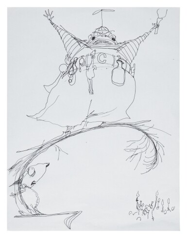
The lines and shapes are simple yet they are pushed to the extreme in a way , giving the character the wonky, mildly anxiety-inducing feeling to it. Giving the fact that it is also going to be a character that needs to be animated I thought that having some clear and divided shapes would help the process. I set myself the goal to keep this in mind developing the character and I will try to push the shapes as well.
With these elements set I started researching Cockney culture a little bit more , in the hope of finding something that i could use as a visual element in order to describe the character and make it feel more grounded.
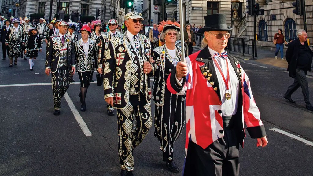
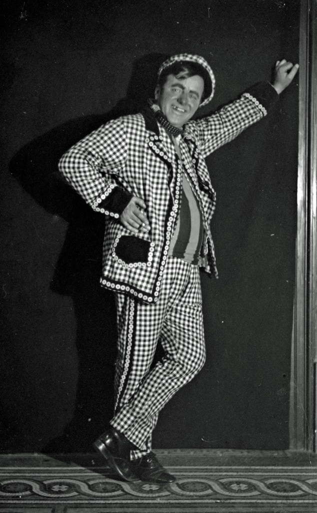

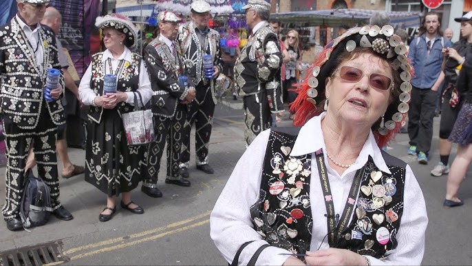
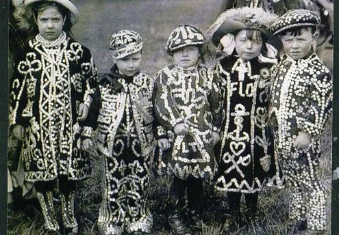
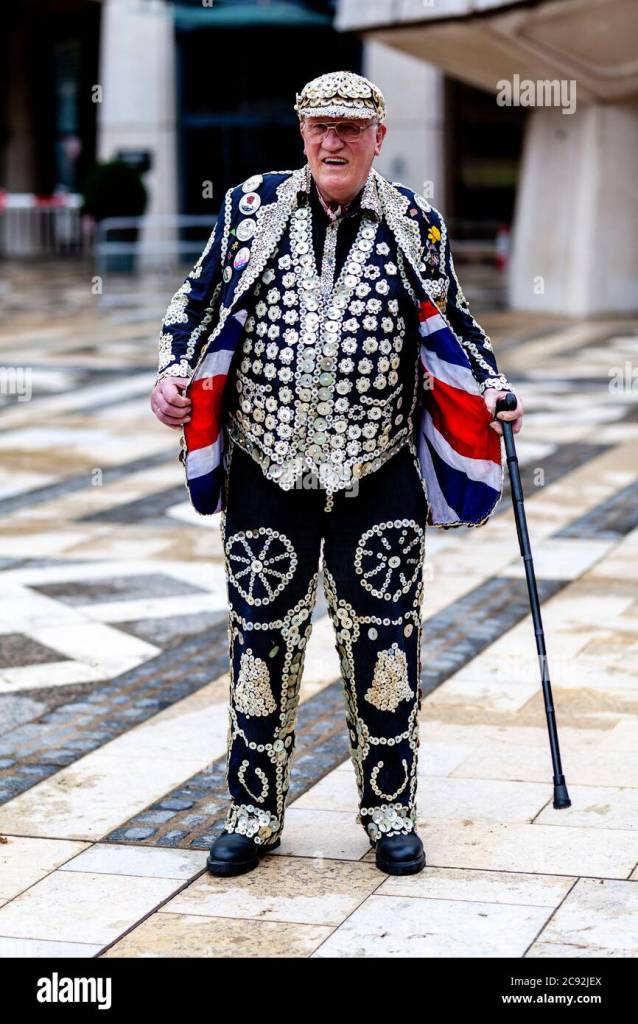
While researching the appearance of the Cockney style, I thought about integrating into the design a hat or a pearly gilet. In terms of mannerism, the stereotypical attitude has been described as exaggerated, loud and sometimes speaking in rhymes.
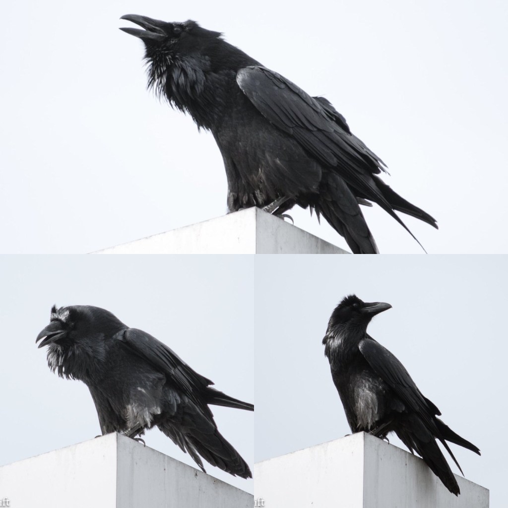
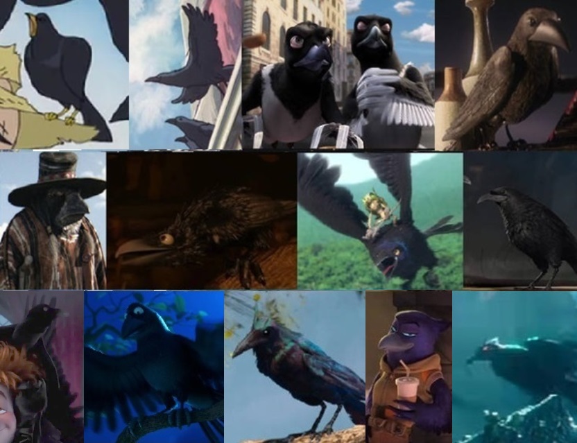
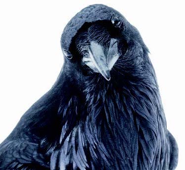
Before starting to draw i collected a few images of crows in real life and crows in animation for reference.
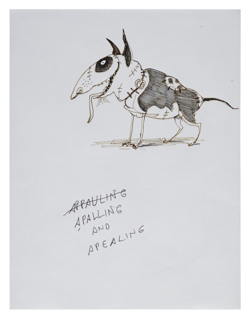
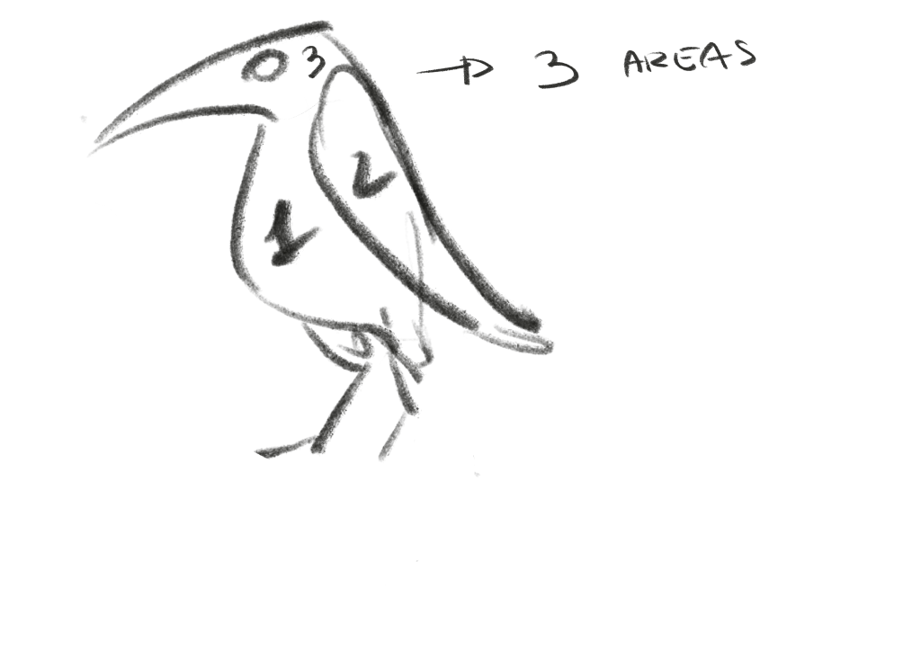
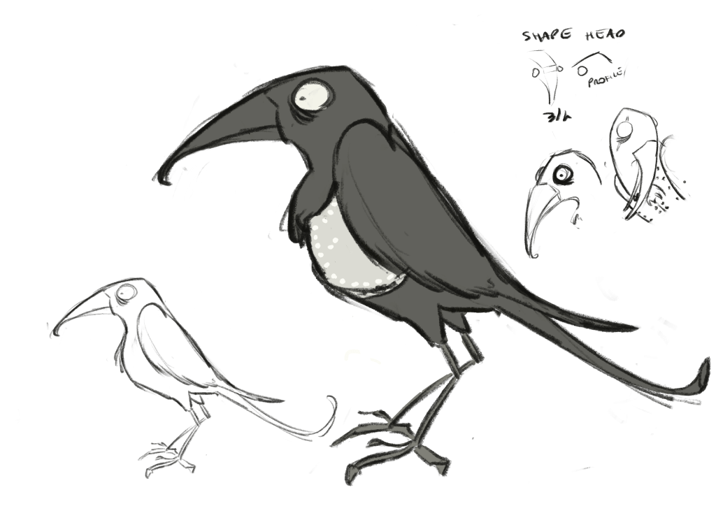
I, therefore, started my design explorations. I started working with a profile as I found it easier to manage the single clean shapes/areas that I thought were useful to keep in mind, as the character at some point is going to be animated.
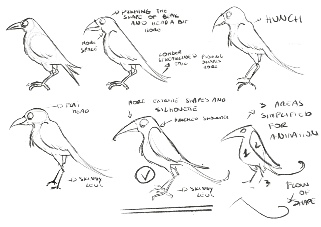
I progressively pushed the shape of the head and proportions trying to make it functional, quick and make the lines sharper. At the beginning I thought such straight lines were too much ( as you can see in the division of shapes), but then once I tried other styles and proportions, I thoght this one was more playful and easier to manage detail-wise.
Following the idea of making it as simple as possible to be animated i decided to put aside any idea of a hat as it would have added another useless layer of complexity. I decided therefore to add a pearly gilet that follow the silhouette.

Leave a comment